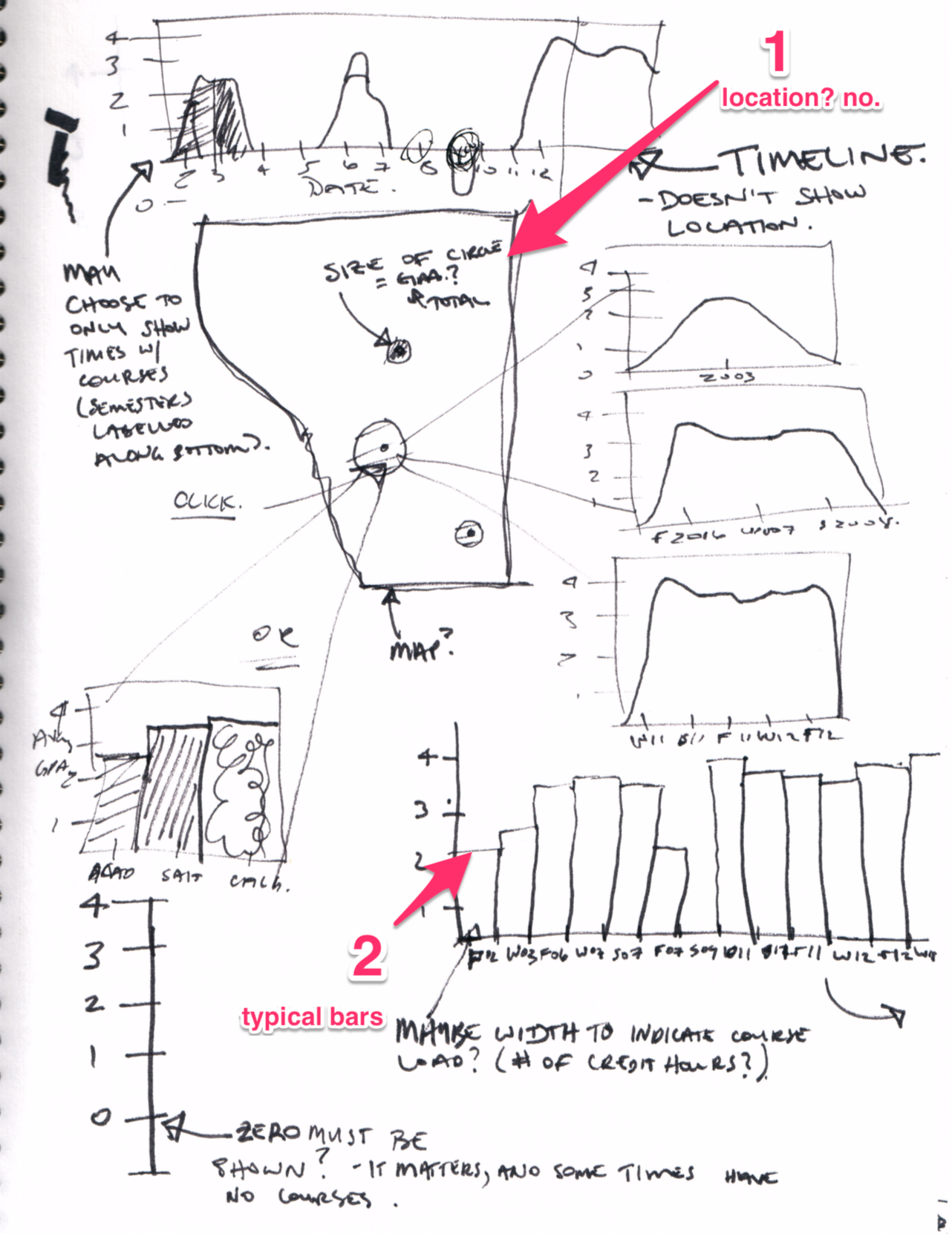
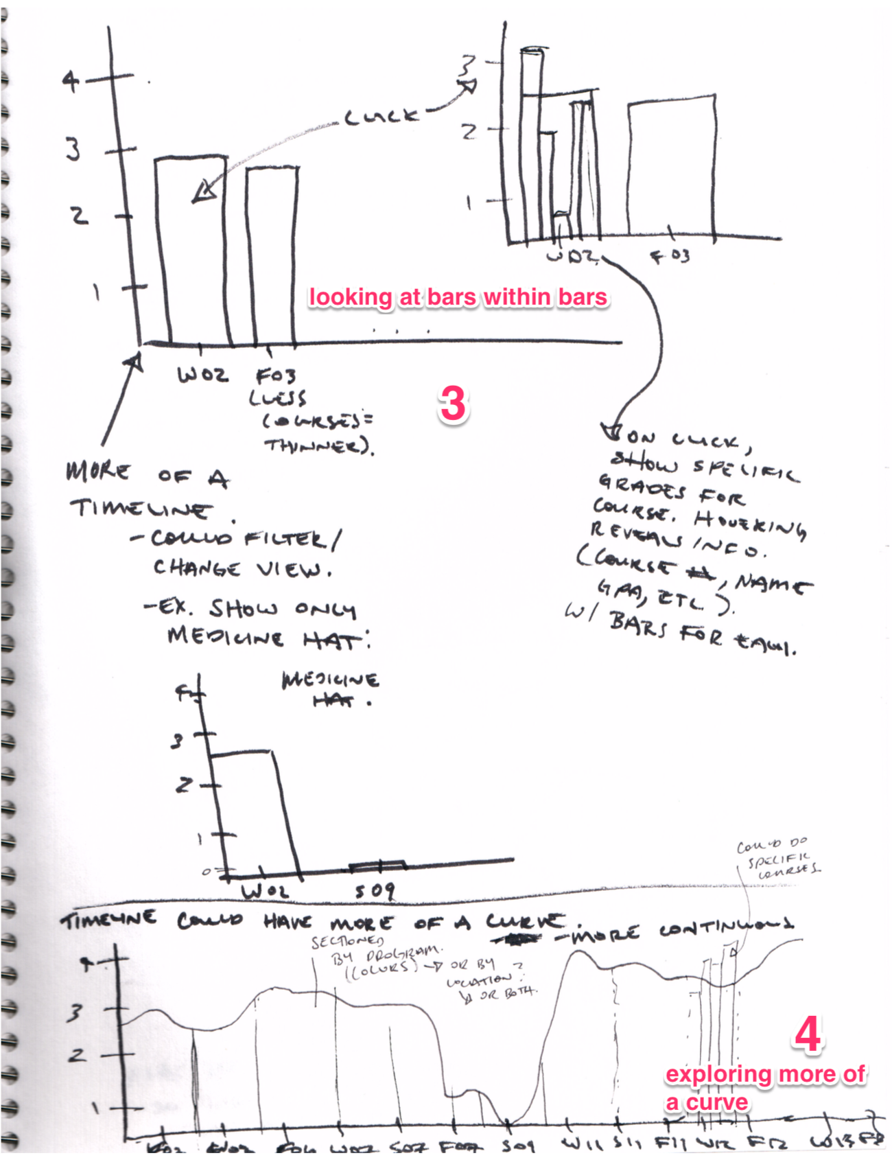
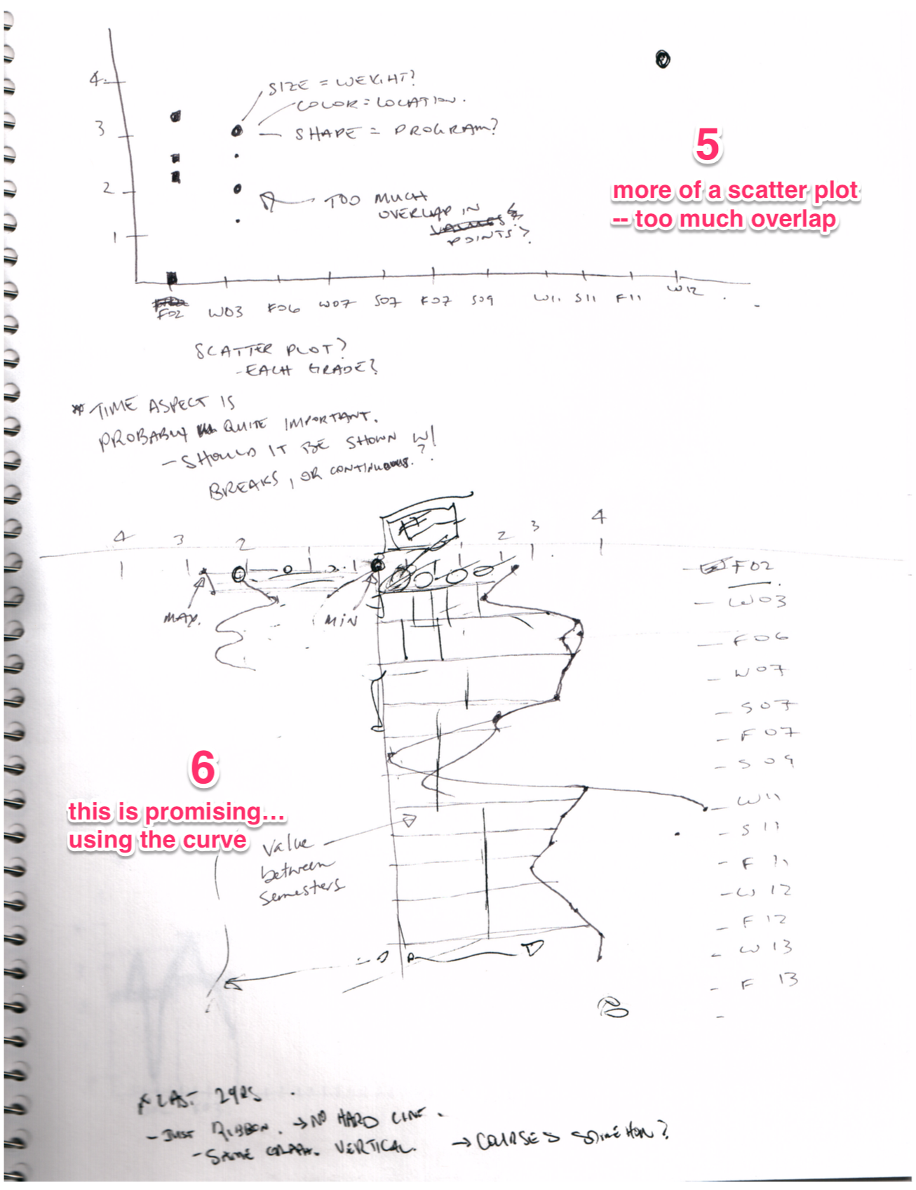
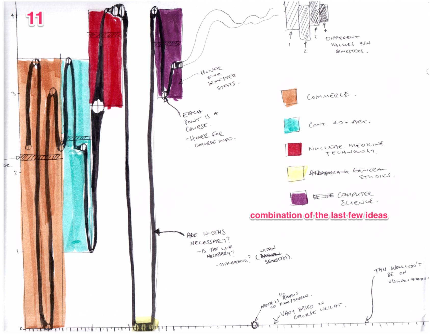
I created this visualization as a CPSC 583 (Information Visualization) project at the University of Calgary. The aim of the project was to visualize my academic performance across a number of institutions and programs. (Funny enough, it's only a "wave" because I was a terrible student early in my academic career.)
The following video demonstrates the visualization. Sketches that provide some insight into my design process are included below.